Rehab Physio Dashboard
A dashboard for physios to build rehab programmes and send them to patients.
- Company
- Hero
- Role
- Product Designer
- Tools
- Figma
The context
Hero is a health-tech company. Its Rehab app gives patients exercises to follow at home, and the physiotherapists who prescribe them needed a way to create that content.
This was a web app for physios, and a good one had to serve the patient at the other end too. A programme that is quick to write but confusing to follow isn't a good programme.
The problem
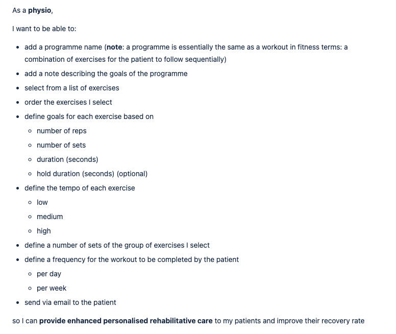
Physiotherapists needed an intuitive way to create rehab programmes, send them to patients and edit them later. It had to be delivered quickly.
Physios aren't designers or power users of software. They're busy and often with a patient in front of them. The tool had to make sense on first use, with no training.
There was also a technical twist. Programmes travel as a bespoke .hero file, so the dashboard had to make that format feel invisible and simple.
How I approached it
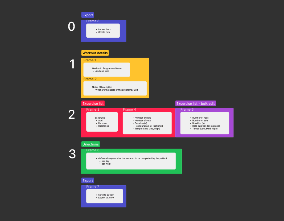
I mapped the physio's job from start to finish: find the right exercises, order them, give the patient clear instructions, send it, and change it later when the patient progresses.
Each step then became one clear place in the interface. I kept the flow linear and forgiving, so a physio who gets interrupted can leave and come back without losing work.
What I did
I designed the whole dashboard and the builder inside it.
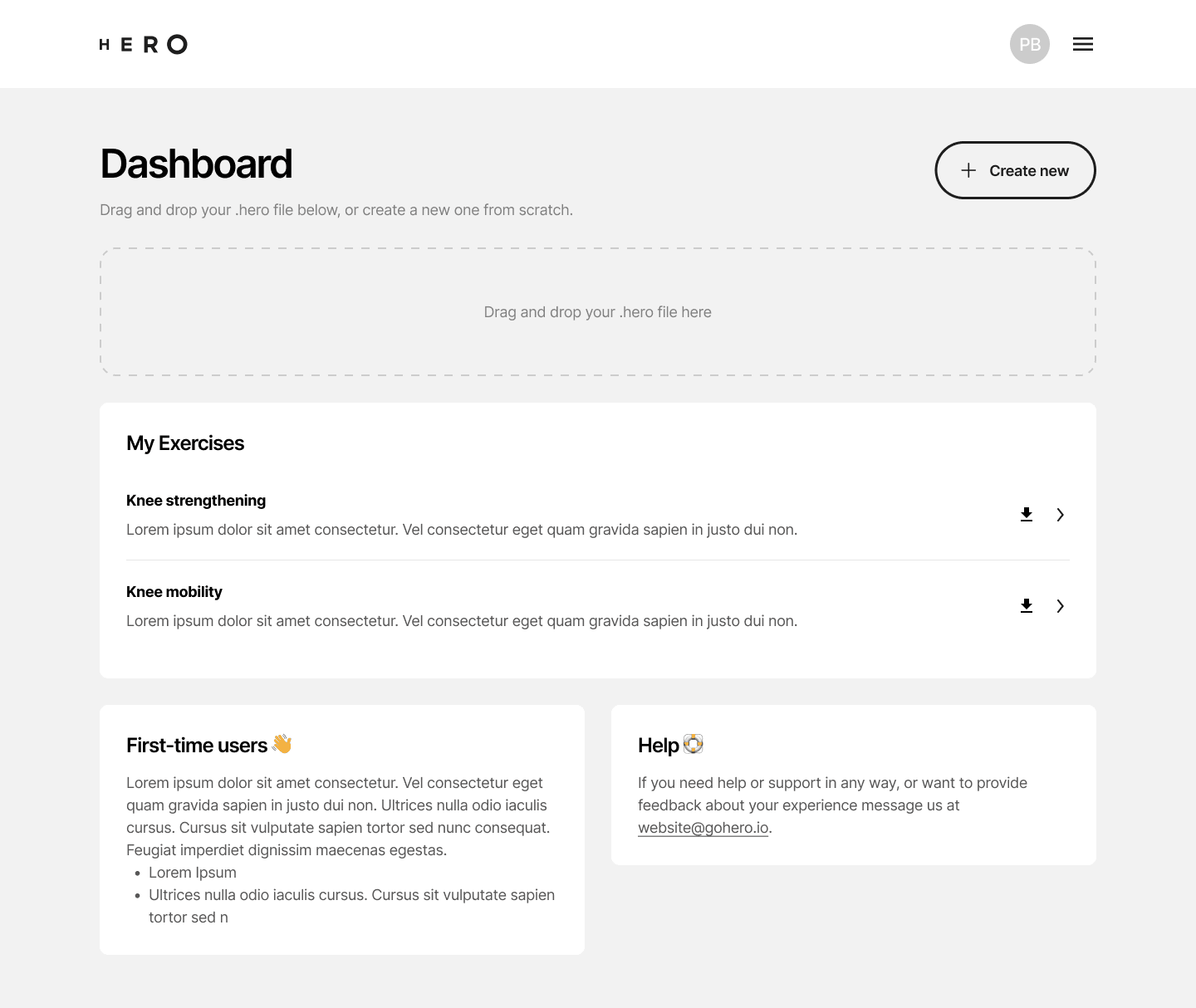
- A dashboard with drag-and-drop import of the bespoke .hero file format, “My exercises”, a first-time guide and a help section.
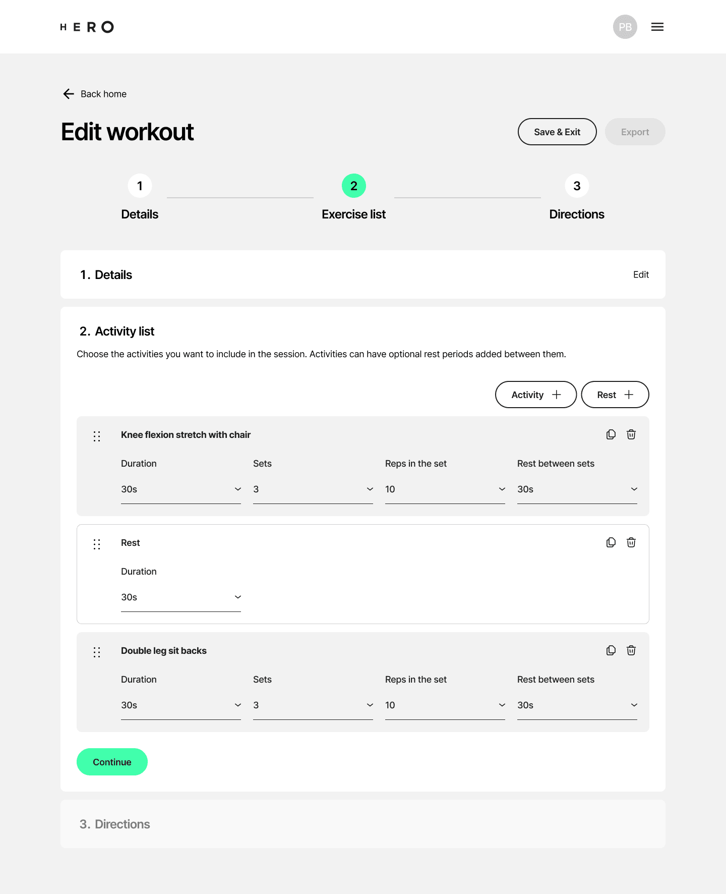
- A programme builder with three parts: Details, Activity list and Directions (custom per-patient instructions).
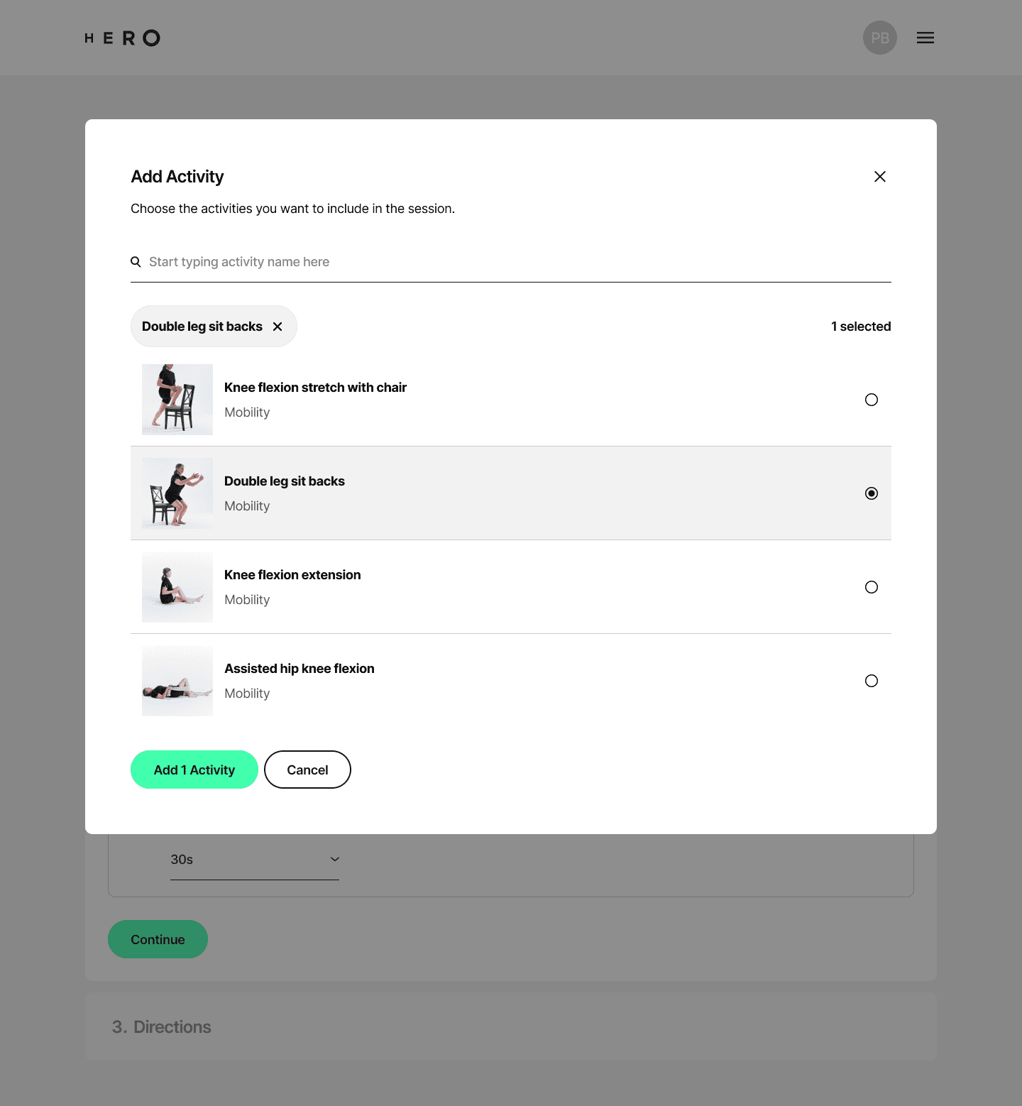
- Exercise search with preview videos and multi-add, so a physio can see what an exercise looks like before adding it and add several at once.
- Save & Exit throughout, so no one loses work if they get pulled away.
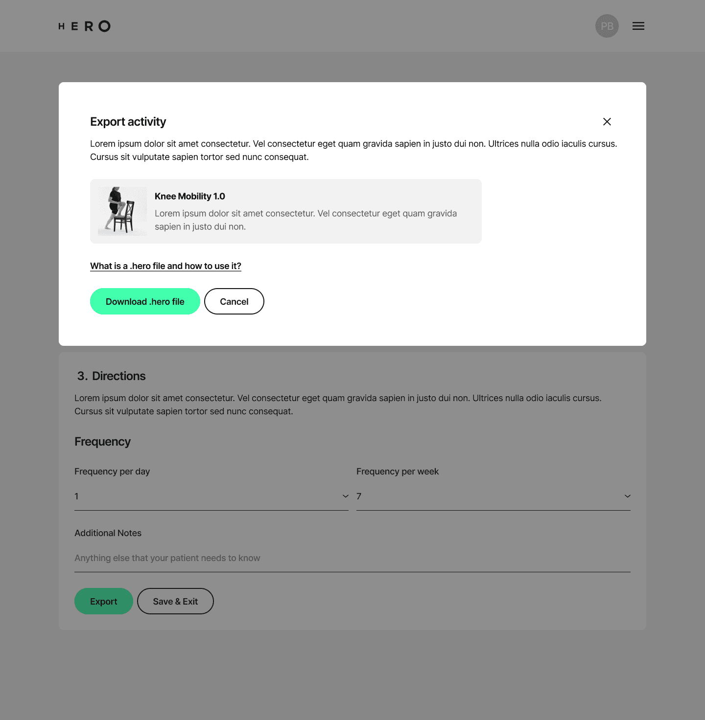
- Export to .hero. The physio sends the .hero file and the patient opens it in the Rehab app.
Why those decisions
Preview videos matter because exercise names are ambiguous, and physios choose by how a movement looks. Multi-add matters because a programme is rarely one exercise.
Directions exist because no two patients are the same. A physio needs room to say “do this slowly” or “stop if it hurts” in their own words, per patient.
The first-time guide and help section carried the onboarding, so the interface itself could stay clean.
Balancing the vision
The brief came with a strong stakeholder vision, and rightly so. My job was to keep that vision intact while weighing it against what physios and patients actually needed, and what the company could deliver quickly.
That meant a lot of conversations, and some trade-offs about what to include first. Being open about those trade-offs kept everyone aligned.
Looking back
One of my favourite briefs. It was a good exercise in balancing stakeholder vision with user and company needs, with real constraints and a clear person on the other side of the screen.
Next work
AI-driven workout app improvements