Crafting a Design System for a B2B giant
Background & Structure change
Caplin Systems ltd. is a leader in creating User Interfaces for FX trading within Banks, for both professional users and client-facing sales people.
Upon my arrival, the design team was in process of migrating their design system from Adobe Xd to Figma.
Having had plenty of design system experience, and it being my niche of sorts, I was eager to help.
First thing, much like at Strike before, I suggested breaking apart the tired, single file system that’s so popular in favour of a more structured approach, involving breaking up all of the content into separate chunks, that are easy and intuitive to navigate.
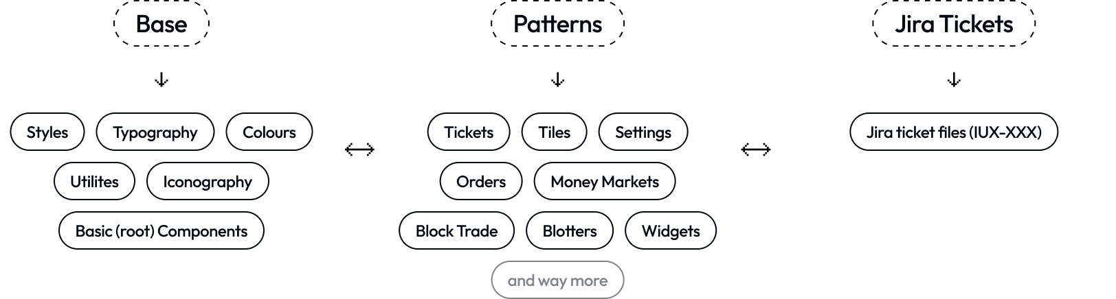
Just like at Strike (company I implemented this system at previously), one look at the contents of the system dictate it’s structure:
Base - where all base, cannot-be-further-broken-down components are styles live, along with design tokens (variables), icons etc.
Patterns - where every ‘entity’ or ‘organism’ has it’s own home, and however many hundreds of variations it has, it can all be neatly contained within feature-specific pages.
Jira tickets - where we keep all Jira tickets regarding to every single piece of work we do as a design team.

Revolution in colour palettes

The Colour Palette project within Bridge is my part in refactoring the original colour palette to be used across every facet of the many apps and their iterations.
A highly conceptual task; the colour palette needed to be extremely easy to understand by anyone, developer, designer, PM, or PO alike.
The result was something I am really proud of, a clear division into 3 categories of colour, designed with development in mind, almost mirroring CSS:
Background - Set of colours for every layer, container or page that it needs it’s own background colour
Foreground - Set of colours that sits upon Background filled containers or elements, such as Text, Icons etc
Border - Set of colours used for borders only with their own specific shades and rules.
Each of those, was then further broken down into sub-categories:
Neutral - covering everything within the greyscale
Semantic - covering all colours for accessible, semantic use cases such as ‘success’, ‘error’, or ‘warning’
Brand - covering brand colours, for that extra personal feel of every product.
It had worked like a charm; we haven’t had a single question like ‘What colour should I apply to this feature?’, and for a Design Ops project, it’s everything you want.
File covers

Often overlooked as something insignificant, or trivial, File covers play an important function in every design system.
When faced through tens, or even hundreds of files, can your developers discern between the files they don’t needs, and ones they do?
This project was created just for that, and it was designed with clear information our users need:
[Link] - a place where we can either mark down origin (Base or Patterns, structure explained above) or link an associated Jira ticket.
Title & Description
Avatar - person assigned to the piece of work, represented in their Slack photo to make it easier to find outside of Figma.
It’s a simple concept and it doesn’t take long to implement. It paid off and we have noticed decreased number of our users asking questions surrounding finding something in Figma. More time to create that spicy product magic!